A New Aviso: The Philosophy Behind Our UI/UX Refresh
Mar 17, 2020

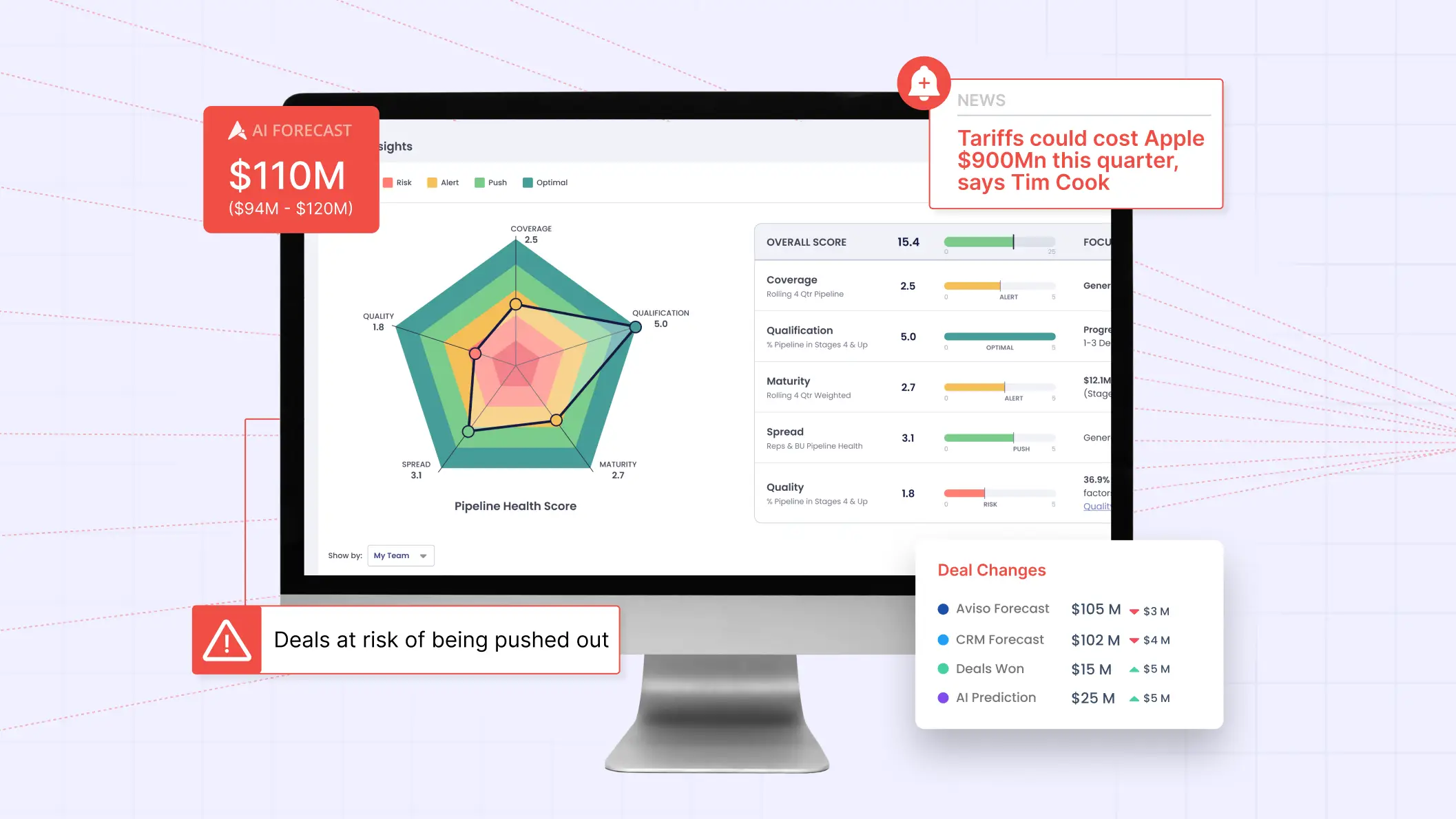
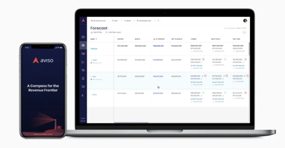
This week, Aviso AI’s new and improved user interface will be released to all of our customers. The past year was an exciting one for Aviso, after Trevor Templar joined as CEO. we embarked on a multi-pronged journey to make core changes to our product that reflect the advancements our company has made in our technology. If you’ve been following our blog you know that our product and engineering teams have been hard at work expanding Aviso AI’s value to users beyond just forecast rollups and deal management. Our AI is now full steam ahead towards a system of AI guidance for all parts of the sales process that we know our users will find essential to their workflow. To mirror this exciting path of our feature set, it was only natural to evolve our product’s look and feel. The design team’s goal was to provide an aesthetic brand refresh to the User Interface (UI) and improve usability of key features for a better User Experience (UX.)

To make this happen, the design team at Aviso spent countless hours:
Analyzing every detail and workflow of our product for usability.
Interpreting feedback from customers.
Researching modern trends and the most current usability patterns.
Iterating on product improvements with great care to balance our new innovations with key functionality our users love from us.

Born from these efforts is a refresh of Aviso AI’s platform with what we have dubbed the Lighthouse User Interface. We’re excited to share these improvements to our AI compass with you.
Here are the improvements you will experience:
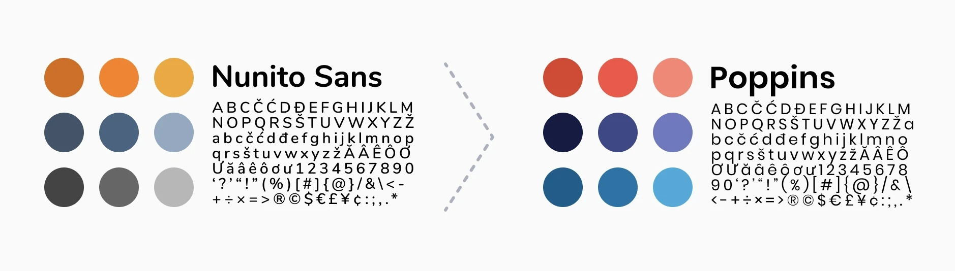
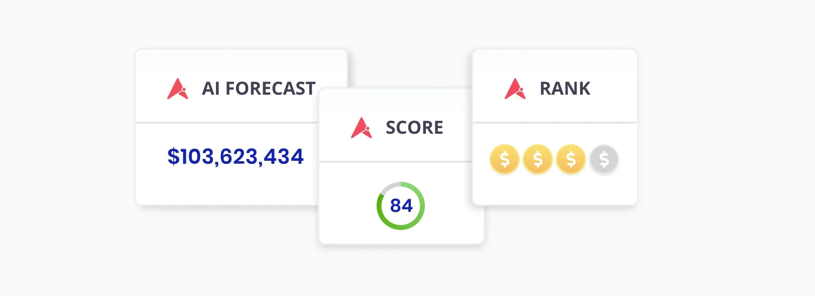
A color palette that utilizes color to guide your eyes to important pieces of data.
A more legible and prominent font set.
Usability improvements that are more intuitive.
Streamlined navigation between and within pages for faster workflows.
Because our product runs on cutting edge AI under the hood, we want our users to be able to get a strong sense of those powerful mechanics while experiencing Aviso on the exterior. An example of this is our application of the Sunset-Red colored Aviso logomark to key AI columns along with a deep blue-ish purple (that we call Evening-Blue) font color to any data that is powered by our AI core.
For our beloved current customers -- these changes mean only that existing product features will be easier to use and more seamless with your daily workflow. For future customers -- we welcome you to explore a new Aviso unveiled for the first time. Join us on this journey as we bring the future of selling to the world. We hope this new Lighthouse UI direction and improvements to usability will allow users to better experience the incredible value Aviso brings to their revenue organizations. Stay tuned for more posts that will go into greater detail about the key areas we made changes to, as well as many more exciting product updates to come! Yours truly, Jesse Zackery, Head of Design